Brooklyn Paper: The Borough’s ‘Backbone’: Brooklyn Org Awards More Than $1.5M to 15 Community Nonprofits
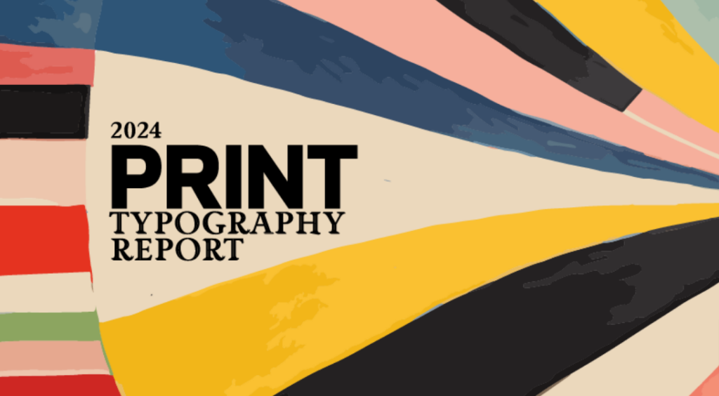
Mother Design’s rebrand of Brooklyn Org strives to bring a new voice to modern philanthropy. According to Design Director Kozue Yamada, “As we explored, we looked at a lot of different condensed typefaces for the wordmark. We were inspired by aspects of PP Formula but ultimately wanted to create something much more condensed, adding rectangular counters and ink traps to reflect the nuances of Brooklyn blocks and streets.”
With the inspiration supplied by Brooklyn’s dense city blocks, the team selected Community Gothic as the voice of the Organization. For Yamada, “We wanted to use a typeface which was born in America, specifically in Brooklyn. Community Gothic was made by Frere-Jones Type, who are based in Brooklyn – a few blocks away from us!”
Yamada also studied other typefaces in the social activism space for inspiration, like Vocal Type’s Martin, citing,
“Brooklyn Org has a bold vision and big goals, so the wordmark needed to reflect that. We wanted the logo to feel big, substantial – like a place where people can come together. We wanted to distance them from the tropes of philanthropy branding and create something vibrant and new.”